September 20, 2016
Flexbox Break Row into Even Amount of Children
Today i needed a Flexbox row to break into an equal amount of tiles. Some Browser support the css page break to achieve this but unfortunately this isn’t working in Google Chrome. So I had to figure something out. The solution is to add an element that is hidden by default and steps in as a line breaker when required. My breakpoint is set to 500px.
|
1 2 3 4 5 6 7 |
<div class="flex-container"> <div class="flex-item"></div> <div class="flex-item"></div> <div class="break"></div> <div class="flex-item"></div> <div class="flex-item"></div> </div> |
|
1 2 3 4 5 6 7 8 9 10 11 12 13 14 15 16 17 18 19 20 21 22 23 24 25 26 27 28 29 |
.flex-container { display: flex; flex-direction: row; flex-wrap: wrap; justify-content: space-between; align-content: stretch; align-items: stretch; } .flex-item { order: 0; flex: 1 1 auto; align-self: auto; margin: 5px; border: 1px solid blue; min-height: 300px; } .break { display: block; height: 1px; width: 100%; } @media screen and (min-width: 500px) { .break { display: none; } } |
Result on screens < 500px width:
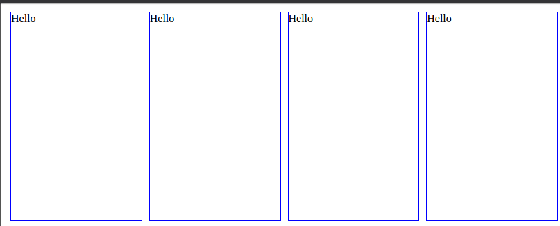
Result on screens > 500px width:


